Student Dropout Analysis
A two-sided platform, EduDropX, pairing a school administration portal with a government analytics dashboard, built to turn dropout data from something India already publishes into something a school or a district office could act on. It won the SSIP 2022 state hackathon and was later published at IEEE I2CT 2024. Group project with Kovil Savaj, Prince Malani and Jay Patel, under the supervision of Prof. Himani Trivedi.

Why this problem
India publishes detailed dropout statistics through UDISE+ every year. Gujarat has a particular dropout rate at the secondary level, a given district sits worse than the state average, and Scheduled Tribe students drop out at higher rates than the General category. The data exists, it is public, and it is granular down to the district.
What it does not tell you is which student at which school is likely to leave next semester.
The gap sits in the unit of analysis. UDISE+ is an aggregate reporting system, where schools submit enrollment counts and the government aggregates upward. By the time a figure surfaces in a policy report, the students it describes have generally already left. There is no individual record and no early warning, only a count after the fact.
SSIP 2022, Gujarat's state innovation hackathon, framed this as an infrastructure problem, asking for a system that could turn dropout data from a lagging indicator into something closer to a leading one.
What the obvious approach gets wrong
The obvious move is to scrape UDISE+, build some visualisations and put them in a dashboard. Most submissions in this space do roughly that, and it produces very little new information. A chart of dropout correlates by father's occupation or family income is descriptive rather than actionable. A policy analyst already knows these correlations exist, and a dashboard that confirms them does not create any mechanism for acting on them.
The deeper limitation is that aggregate data cannot support an individual prediction. A model trained on state-level UDISE+ features can tell you which districts carry more risk. It cannot tell a principal in Ahmedabad which three students in their school are likely to leave before the year ends, because that prediction needs student-level signal such as attendance, academic performance and family financial circumstances, and that signal currently exists only inside each school and never leaves it except as an aggregate count.
The core decision
The platform has two sides, and both had to exist for either to be useful.
The first is a school administration portal, built on Flask with Jinja2 templates, where authorised staff register the school and then enter student records: demographic details, family background, academic history and financial indicators, organised across the same categories the underlying MySQL schema uses, namely student and parent details, academic and financial details, and attendance and cause-of-risk details. Records can be entered individually or uploaded in bulk as a CSV, which matters in practice, since a school with several hundred students is not going to hand-enter each one but might well export a file from whatever system it already uses.
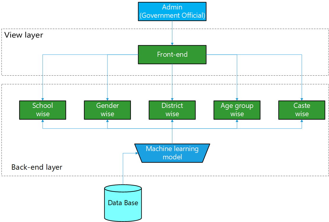
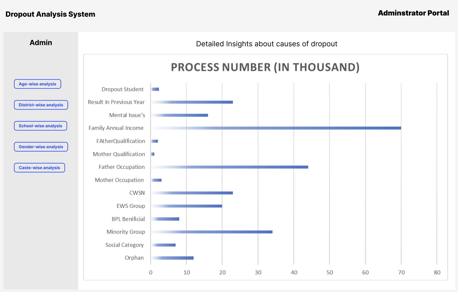
The second is a government analytics dashboard, built separately as a React 18 application, where an official can view the same underlying data broken down by school, gender, district, age group and caste, backed by a Gujarat district choropleth built on Leaflet and demographic breakdowns rendered with Highcharts 3D.
Dropout prediction at the student level needs data that only schools hold, which means the harder design problem is not the regression model, it is building the collection mechanism that produces the training signal in the first place.
It is worth being precise about what the machine learning component actually predicts, because this is where the project's ambition and its evaluation diverge somewhat. The regression models, Simple Linear and Multiple Polynomial up to degree seven, were trained on UDISE+ aggregate statistics combined with the field-collected school data, and what they output are dropout rate projections by category: by gender, by caste and by school tier. That is a genuinely useful policy tool, since it tells an official where to look. It is not, however, a per-student risk score. The individual-level early warning that the platform offers is a separate, simpler mechanism, a rule flagging any student whose attendance falls below 60 percent. The two features sit side by side in the dashboard, but only one of them is the trained model, and it is worth not conflating the two when describing what the system does.
How it was built
The school side runs through Flask, serving a registration flow (school name, address, state, district, contact details) followed by a student record form covering the categories above, plus the CSV upload path for schools bringing in existing data in bulk. Records land in MySQL, in a schema (ssip_final_project) with separate tables for student and parent details, academic and financial details, attendance and cause data, and school details.
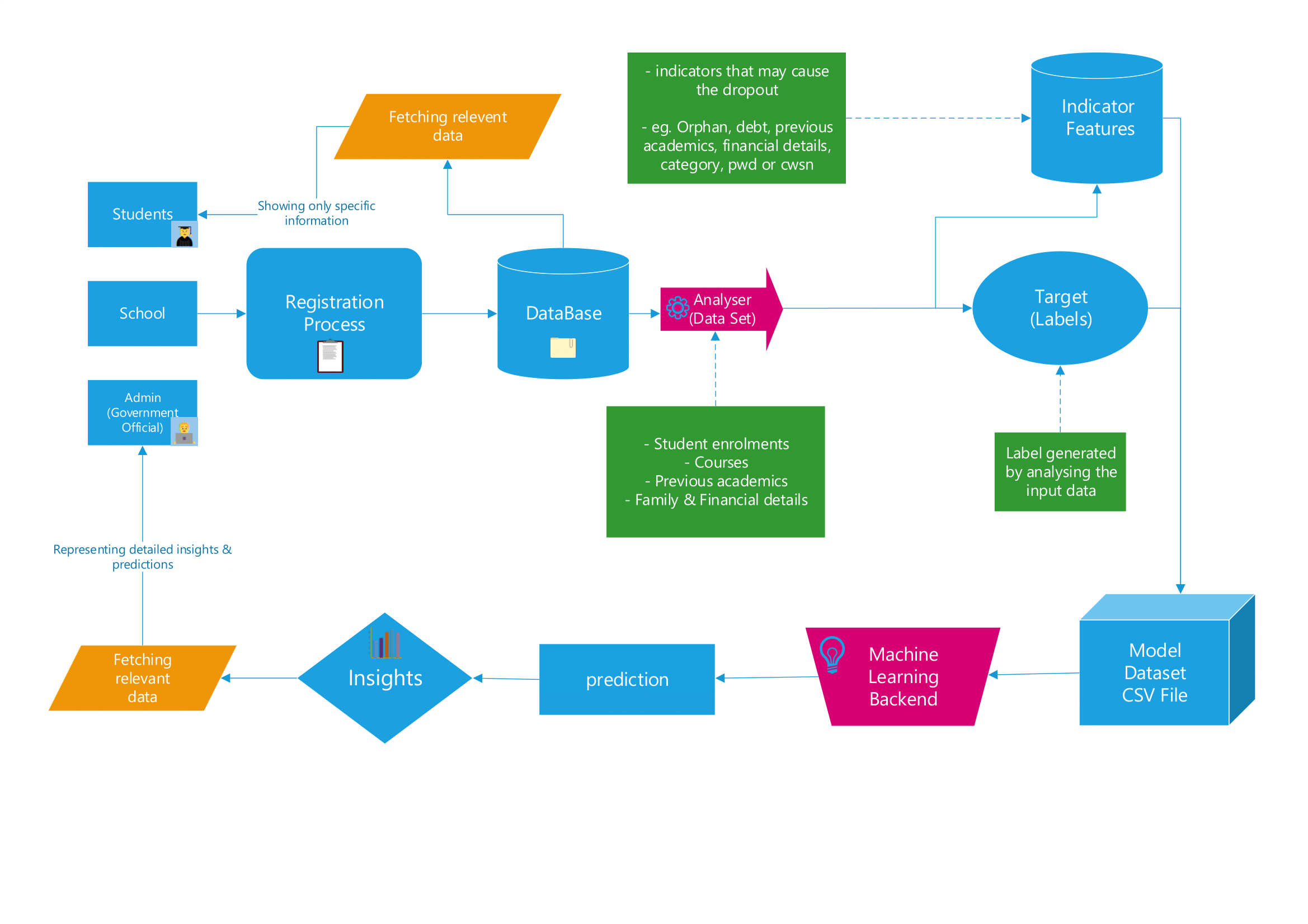
The regression pipeline runs on pandas and scikit-learn, reading from that schema, trained separately for gender, caste and school-tier dimensions, with predictions written back into a dedicated prediction_data table rather than computed live on every request. A Flask REST API under /api/v1/ then serves both the raw aggregations and the cached predictions to the frontend as JSON.
The government dashboard consumes that API from React 18, and beyond the choropleth and the Highcharts breakdowns it includes a student search and report generator, letting an official pull up a specific record rather than only viewing aggregates.
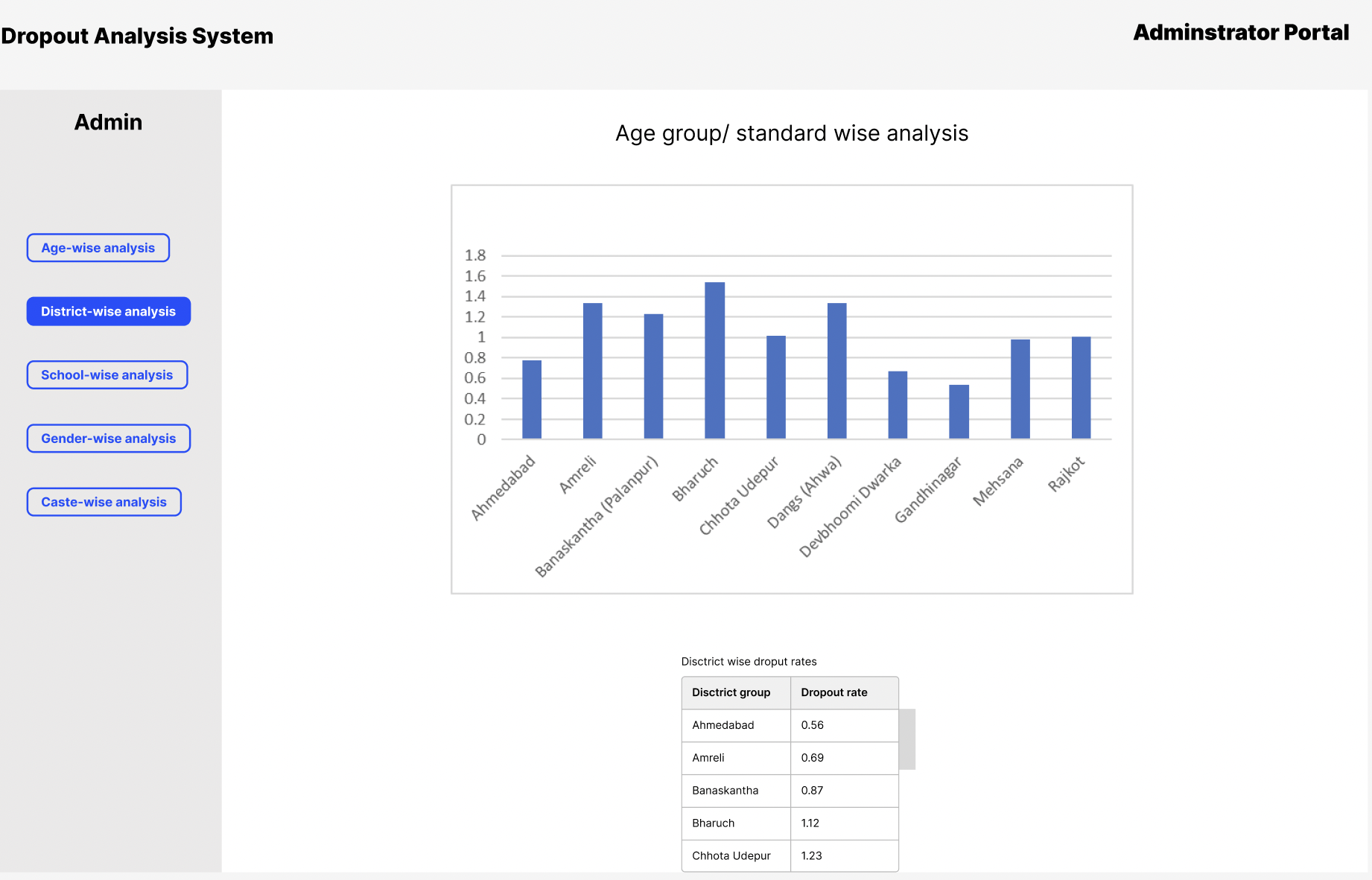
What worked, what didn't
The regression results are the clearest part of the project, and the honest story in them is about overfitting rather than accuracy.
Across all three dimensions the report evaluated, simple linear regression, degree one, was the best-performing model: an R² of 0.9976 and MAE of 0.2311 for the gender-wise analysis, an R² of 0.9962 and MAE of 0.7168 for caste, and an R² of 0.9523 and MAE of 0.2311 for school category. Higher-degree polynomials did not help. On the caste-wise data specifically, R² holds up through cubic (0.9945 at degree three) and then collapses: 0.7253 at quartic, 0.095 at quintic, and negative from sextic onward, with the regression score falling to roughly negative 2.18 billion at degree seven. That is not a subtle overfitting curve, it is a model breaking down almost completely once the polynomial degree exceeds what the underlying relationship supports.
Oddly, the school-category-wise table does not show the same collapse. R² there rises slightly and steadily from 0.9523 at degree one to 0.9530 at degree seven, with no instability at all. That asymmetry between the three dimensions is not explained anywhere in the paper, and it is worth investigating rather than treating as a footnote, since a regression setup that overfits catastrophically on one target and not at all on another, using the same modelling approach, suggests something about the feature relationships that differs between them.
The category-level projections themselves are specific enough to be useful on their own. By school tier, projected dropout runs 10.72 percent at primary, 33.63 percent at secondary, and 55.65 percent at higher secondary, which locates the main attrition point at the transition into higher secondary rather than earlier. By caste, the General, OBC and SC categories cluster closely together at 19.70, 19.90 and 20.94 percent, while Scheduled Tribe students sit apart at 39.46 percent, roughly double the others. By gender the split is close to even, 51.19 percent male against 48.81 percent female.
The methodology section describes testing polynomial degrees up to twelve, but the results tables only go as far as degree seven, presumably because degrees beyond that were already numerically unstable and not worth reporting. That gap between the stated method and the reported results is a minor inconsistency worth resolving if the paper is revised.
What I'd do differently
I would separate the category-level regression from the individual-level attendance alert more clearly in how the system is described and evaluated, since right now they read as one predictive feature when they are two different mechanisms with different guarantees. The regression has real, measured accuracy on aggregate targets. The attendance rule has none reported at all, and testing it against actual dropout outcomes would tell us whether 60 percent is even the right threshold.
I would also design toward longitudinal prediction rather than a static snapshot. The current model predicts a category-level rate from a fixed set of features. A more useful formulation would track a given student's record across the academic year, which needs the data model to capture attendance and marks at multiple points in time rather than once at enrollment, and that is a schema change as much as a modelling one.
Finally, I would resolve the caste-wise overfitting asymmetry before extending the model further. Understanding why one dimension degrades so sharply with polynomial degree while another does not would likely improve both, and right now that difference is simply unexplained.